Dimensionality Reduction
The first subfield of unsupervised learning that we look at is dimensionality reduction:
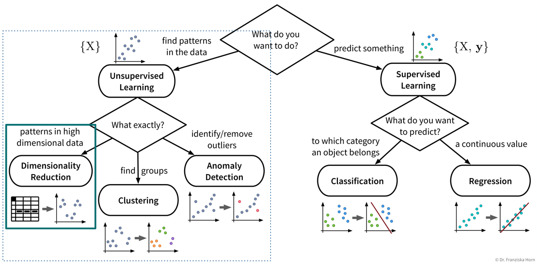
- Goal
-
Reduce the number of features without loosing relevant information.
- Advantages
-
-
Reduced data needs less memory (usually not that important anymore today)
-
Noise reduction (by focusing on the most relevant signals)
-
Create a visualization of the dataset (what we are mostly using these algorithms for)
-
- Example: Embed images of hand written digits in 2 dimensions
-
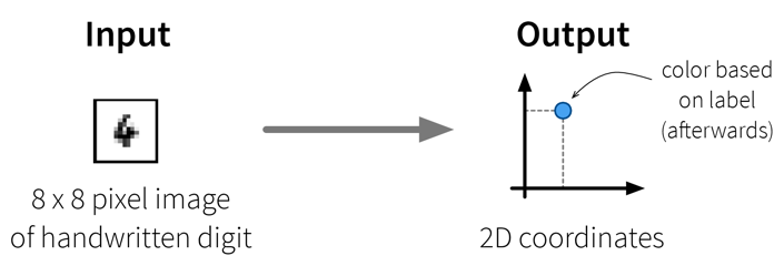 The dataset in this small example consists of a set of 8 x 8 pixel images of handwritten digits, i.e., each data point can be represented as a 64-dimensional input feature vector containing the gray-scale pixel values. Usually, this dataset is used for classification, i.e., where a model should predict which number is shown on the image. We instead only want to get an overview of the dataset, i.e., our goal is to reduce the dimensionality of this dataset to two coordinates, which we can then use to visualize all samples in a 2D scatter plot. Please note that the algorithms only use the original image pixel values as input to compute the 2D coordinates, but afterwards we additionally use the labels of the images (i.e., the digit shown in the image) to give the dots in the plot some color to better interpret the results.
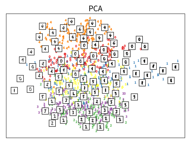
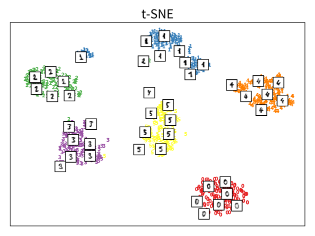
The two plots show the results, i.e., the 2-dimensional representation of the dataset created with two different dimensionality reduction algorithms, PCA and t-SNE. Each point or thumbnail in the plot represents one data point (i.e., one image) and the colors, numbers, and example images were added after reducing the dimensionality so the plot is easier to interpret.
There is no right or wrong way to represent the data in 2D — it’s an unsupervised learning problem, which by definition has no ground truth answer. The algorithms arrive at two very different solutions, since they follow different strategies and have a different definition of what it means to preserve the relevant information. While PCA created a plot that preserves the global relationship between the samples, t-SNE arranged the samples in localized clusters.
The remarkable thing here is that these methods did not know about the fact that the images displayed different, distinct digits (i.e., they did not use the label information), yet t-SNE grouped images showing the same number closer together. From such a plot we can already see that if we were to solve the corresponding classification problem (i.e., predict which digit is shown in an image), this task should be fairly easy, since even an unsupervised learning algorithm that did not use the label information showed that images displaying the same number are very similar to each other and can easily be distinguished from images showing different numbers. Or conversely, if our classification model performed poorly on this task, we would know that we have a bug somewhere, since apparently the relevant information is present in the features to solve this task.
| Please note that even though t-SNE seems to create clusters here, it is not a clustering algorithm. As a dimensionality reduction algorithm, t-SNE produces a set of new 2D coordinates for our samples and when plotting the samples at these coordinates, they happen to be arranged in clusters. However, a clustering algorithm instead outputs cluster indices, that state which samples were assigned to the same group (which could then be used to color the points in the 2D coordinate plot). |
Principal Component Analysis (PCA)
- Useful for
-
General dimensionality reduction & noise reduction.
⇒ The transformed data is sometimes used as input for other algorithms instead of the original features. - Main idea
-
Compute the eigendecomposition of the dataset’s covariance matrix, a symmetric matrix of size \(d \times d\) (with d = number of original input features), which states how strongly any two features co-vary, i.e., how related they are, similar to the linear correlation between two features.
By computing the eigenvalues and -vectors of this matrix, the main directions of variance in the data are identified. These are the principle components and can be expressed as linear combinations of the original features. We then reorient the data along these new axis.
Have a look at this video for a more detailed explanation.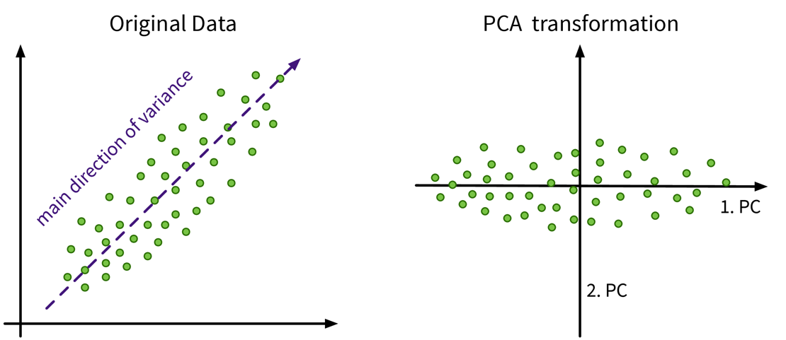 In this example the original data only has two features anyways, so a dimensionality reduction does not make much sense, but it nicely illustrates how the PCA algorithm works: The main direction of variance is selected as the first new dimension, while the direction with the next strongest variation (orthogonal to the first) is the second new dimension. These new dimensions are the principle components. The data is then be rotated accordingly, such that the amount of variance in the data, i.e., the information content and therefore also the eigenvalue associated with the principle components, decreases from the first to the last of these new dimensions.
from sklearn.decomposition import PCAImportant Parameters:
-
→
n_components: New dimensionality of data; this can be as many as the original features (or the rank of the feature matrix).
- Pros
-
-
Linear algebra based: solution is a global optima, i.e., when we compute PCA multiple times on the same dataset we’ll always get the same results.
-
Know how much information is retained in the low dimensional representation; stored in the attributes
explained_variance_ratio_orsingular_values_/eigenvalues_(= eigenvalues of the respective PCs):
The principle components are always ordered by the magnitude of their corresponding eigenvalues (largest first);
When using the first k components with eigenvalues \(\lambda_i\), the amount of variance that is preserved is: \(\frac{\sum_{i=1}^k \lambda_i}{\sum_{i=1}^d \lambda_i}\).
Note: If the intrinsic dimensionality of the dataset is lower than the original number features, e.g., because some features were strongly correlated, then the last few eigenvalues will be zeros. You can also plot the eigenvalue spectrum, i.e., the eigenvalues ordered by their magnitude, to see how many dimensions you might want to keep, i.e., where this curve starts to flatten out.
-
- Careful
-
-
Computationally expensive for many (> 10k) features.
Tip: If you have fewer data points than features, consider using Kernel PCA instead: This variant of the PCA algorithm computes the eigendecomposition of a similarity matrix, which is \(n \times n\) (with n = number of data points), i.e., when n < d this matrix will be smaller than the covariance matrix and therefore computing its eigendecomposition will be faster. -
Outliers can heavily skew the results, because a few points away from the center can introduce a large variance in that direction.
-
t-SNE
- Useful for
-
Visualizing data in 2D — but please do not use the transformed data as input for other algorithms.
- Main idea
-
Randomly initialize the points in 2D and move them around until their distances in 2D match the original distances in the high dimensional input space, i.e., until the points that were similar to each other in the original high dimensional space are located close together in the new 2D map of the dataset.
→ Have a look at the animations in this great blog article to see t-SNE in action!
from sklearn.manifold import TSNEImportant Parameters:
-
→
perplexity: Roughly: how many nearest neighbors a point is expected to have. Have a look at the corresponding section in the blog article linked above for an example. However, what an appropriate value for this parameter is depends on the size and diversity of the dataset, e.g., if a dataset consists of 1000 images with 10 classes, then a perplexity of 5 might be a reasonable choice, while for a dataset with 1 million samples, 500 could be a better value.
The original paper says values up to 50 work well, but in 2003 “big data” also wasn’t a buzzword yet ;-) -
→
metric: How to compute the distances in the original high dimensional input space, which tells the model which points should be close together in the 2D map.
- Pros
-
-
Very nice visualizations.
-
- Careful
-
-
Algorithm can get stuck in a local optimum, e.g., with some points trapped between clusters.
-
Selection of distance metric for heterogeneous data ⇒ normalize!
-