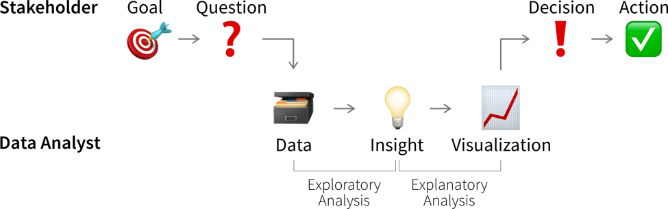
Data Analysis
Analyzing data is not only an important step before using this data for a machine learning project, but can also generate valuable insights that result in better (data-driven) decisions. We usually analyze data for one of two reasons:
-
We need some specific information to make a (better) decision (reactive analysis, e.g., when something went wrong and we don’t know why).
-
We’re curious about the data and don’t know yet what the analysis will bring (proactive analysis, e.g., to better understand the data at the beginning of an ML project).
- Data analysis results can be obtained and communicated in different formats
-
-
A custom analysis with results presented, e.g., in a power point presentation
-
A standardized report, e.g., in form of a PDF document, showing static data visualizations of historical data
-
A dashboard, i.e., a web app showing (near) real-time data, usually with some interactive elements (e.g., options to filter the data)
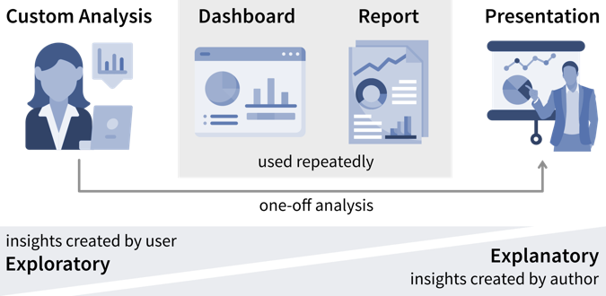
While the data story that is told in a presentation is usually fixed, users have more opportunities to interpret the data and analyze it for themselves in an interactive dashboard.
-
What all forms of data analyses have in common is that we’re after “(actionable) insights”.
- What is an insight?
-
Psychologist Gary Klein defines an insight as “an unexpected shift in the way we understand things”.
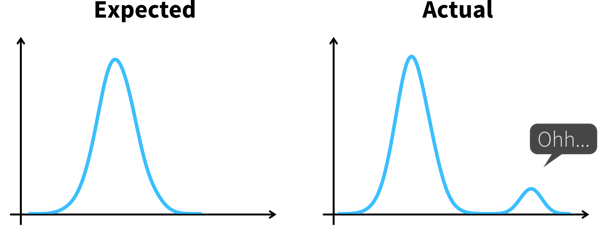
Arriving at an insight requires two steps:
-
Notice something unexpected, e.g., a sudden drop or increase in some metric.
-
Understand why this happened, i.e., dig deeper into the data to identify the root cause.
When we understand why something happened, we can often also identify a potential action that could get us back on track, thereby making this an actionable insight.
| Knowing which values are unexpected and where it might pay off to dig deeper often requires some domain knowledge, so you might want to examine the results together with a subject matter expert. |
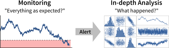
Ideally, we should continuously monitor important metrics in dashboards or reports to spot deviations from the norm as quickly as possible, while identifying the root cause often requires a custom analysis.
| As a data analyst you are sometimes approached with more specific questions or requests such as “We’re deciding where to launch a new marketing campaign. Can you show me the number of users for all European countries?”. In these cases it can be helpful to ask “why?” to understand where the person noticed something unexpected that prompted this analysis request. If the answer is “Oh, we just have some marketing budget left over and need to spend the money somewhere” then just give them the results. But if the answer is “Our revenue for this quarter was lower than expected” it might be worth exploring other possible root causes for this, as maybe the problem is not the number of users that visit the website, but that many users drop out before they reach the checkout page and the money might be better invested in a usability study to understand why users don’t complete the sale. |
Data-driven Decisions
While learning something about the data and its context is often interesting and can feel rewarding by itself, it is not yet valuable. Insights become valuable when they influence a decision and inspire a different course of action, better than the default that would have been taken without the analysis.
This means we need to understand which decision(s) the insights from our data analysis should influence.
| Not all decisions need to be made in a data-driven way. But decision makers should be transparent and upfront about whether a decision can be influenced by analysis results, i.e., what data would make them change their mind and choose a different course of action. If data is only requested to support a decision that in reality has already been made, save the analysts the time and effort! |
Before we conduct a data analysis we need to be clear on:
-
Who are the relevant stakeholders, i.e., who will consume the data analysis results (= our audience / dashboard users)?
-
What is their goal?
In business contexts, the users' goals are usually in some way related to making a profit for the company, i.e., increasing revenue (e.g., by solving a customer problem more effectively than the competition) or reducing costs.
The progress towards these goals is tracked with so called Key Performance Indicators (KPIs), i.e., custom metrics that tell us how well things are going. For example, if we’re working on a web application, one KPI we might want to track could be “user happiness”. Unfortunately, true user happiness is difficult to measure, but we can instead check the number of users returning to our site and how long they stay and then somehow combine these and other measurements into a proxy variable that we then call “user happiness”.
| A KPI is only a reliable measure, if it is not simultaneously used to control people’s behavior, as they will otherwise try to game the system (Goodhart’s Law). For example, if our goal is high quality software, counting the number of bugs in our software is not a reliable measure for quality, if we simultaneously reward programmers for every bug they find and fix. |
The first step when making a data-driven decision is to realize that we should act by monitoring our KPIs to see whether we’re on track to achieve our goals.
Ideally, this is achieved by combining these metrics with thresholds for alerts to automatically notify us if things go south and a corrective action becomes necessary. For example, we could establish some alert on the health of a system or machine to notify a technician when maintenance is necessary. To avoid alert fatigue, it is important to reduce false alarms, i.e., configure the alert such that the responsible person tells you “when this threshold is reached, I will drop everything else and go fix the problem” (not “at this point we should probably keep an eye on it”).
Depending on how frequently the value of the KPI changes and how quickly corrective actions show effects, we want to check for the alert condition either every few minutes to alert someone in real time or, for example, every morning, every Monday, or once per month if the values change more slowly.
- Is this significant?
-
Small variations in KPIs are normal and we should not overreact to noise. Statistics can tell us whether the observed deviation from what we expected is significant.
Statistical inference enables us to draw conclusions that reach beyond the data at hand. Often we would like to make a statement about a whole population (e.g., all humans currently living on this earth), but we only have access to a few (hopefully representative) observations to draw our conclusion from. Statistical inference is about changing our mind under uncertainty: We start with a null hypothesis (i.e., what we expected before looking at the data) and then check if what we see in the sample dataset makes this null hypothesis look ridiculous, at which point we reject it and go with our alternative hypothesis instead.
Example: Your company has an online store and wants to roll out a new recommendation system, but you are unsure whether customers will find these recommendations helpful and buy more. Therefore, before going live with the new system, you perform an A/B test, where a percentage of randomly selected users see the new recommendations, while the others are routed to the original version of the online store. The null hypothesis is that the new version is no better than the original. But it turns out that the average sales volume of customers seeing the new recommendations is a lot higher than that of the customers browsing the original site. This difference is so large that in a world where the null hypothesis was true, it would be extremely unlikely that a random sample would give us these results. We therefore reject the null hypothesis and go with the alternative hypothesis, that the new recommendations generate higher sales.In addition to rigorous statistical tests, there are also some rules of thumb to determine whether changes in the data warrant our attention: If a single sample lies three standard deviations (\(\sigma\)) above or below the mean or seven consecutive points fall above or below the average value, this is cause for further investigation.
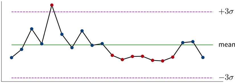 A control chart showing measurements taken over time that fluctuate around their mean value with points of interest marked in red.
Read this article to learn more about the difference between analysts and statisticians and why they should work on distinct splits of your dataset.
For every alert that is created, i.e., every time it is clear that a corrective action is needed, it is worth considering whether this action can be automated and to directly trigger this automated action together with the alert (e.g., if the performance of an ML model drops below a certain threshold, instead of just notifying the data scientist we could automatically trigger a retraining with the most recent data). If this is not possible, e.g., because it is not clear what exactly happened and therefore which action should be taken, we need a deeper analysis.
Digging deeper into the data can help us answer questions such as “Why did we not reach this goal and how can we do better?” (or, in rarer cases, “Why did we exceeded this goal and how can we do it again?”) to decide on the specific action to take.
| Don’t just look for data that confirms the story you want to tell and supports the action you wanted to take from the start (i.e., beware of confirmation bias)! Instead be open and actively try to disprove your hypothesis. |
Such an exploratory analysis is often a quick and dirty process where we generate lots of plots to better understand the data and where the difference between what we expected and what we saw in the data is coming from, e.g., by examining other correlated variables. However, arriving at satisfactory answers is often more art than science.
| When using an ML model to predict a KPI, we can interpret this model and its predictions to better understand which variables might influence the KPI. Focusing on the features deemed important by the ML model can be helpful if our dataset contains hundreds of variables and we don’t have time to look at all of them in detail. But use with caution — the model only learned from correlations in the data; these do not necessarily represent true causal relationships between the variables. |
- Analysis questions to answer before an ML project
-
-
Examine the raw data:
-
Is the dataset complete, i.e., does it contain all the variables and samples we expected to get?
-
-
Examine summary statistics (e.g., mean, standard deviation (std), min/max values, missing value count, etc.), for example, by calling
df.describe()on a pandas data frame:-
What does each variable mean? Given our understanding of the variable, are its values in a reasonable range?
-
Are missing values encoded as NaN (Not a Number) or as ‘unrealistic’ numeric values (e.g., -1 while normal values are between 0 and 100)?
-
Are missing values random or systematic (e.g., in a survey rich people are less likely to answer questions about their income or specific measurements are only collected under certain conditions)? → This can influence how missing values should be handled during preprocessing, e.g., whether it makes sense to impute them with the mean or some other specific value (e.g., zero).
-
-
Examine the distributions of individual variables (e.g., using histograms):
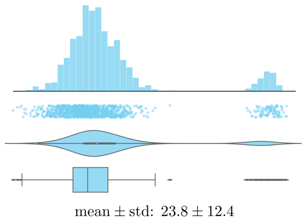 Histogram, strip plot, violin plot, box plot, and summary statistics of the same data.
-
Are there any outliers? Are these genuine edge cases or can they be ignored (e.g., due to measurement errors or wrongly encoded data)?
-
Is the data normally distributed (otherwise we may have to transform the variable later)?
-
-
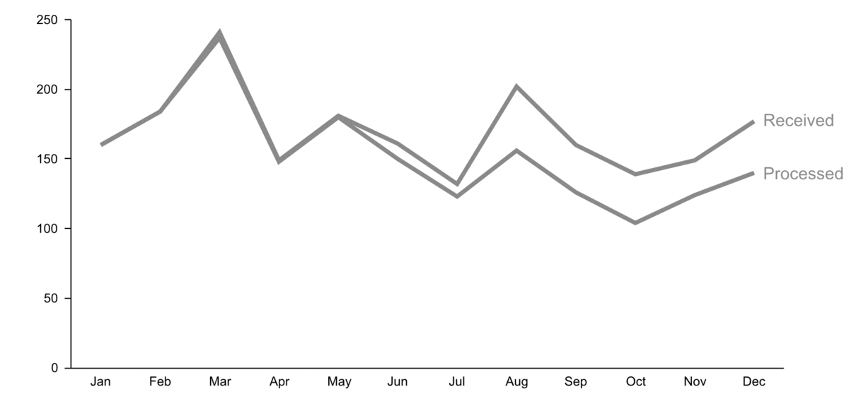
Examine trends over time (by plotting variables over time):
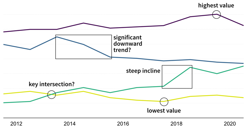 What caused these trends and what are their implications for the future? [Adapted from: Data Visualization: A successful design process by Andy Kirk]
-
Are there time periods where the data was sampled irregularly or samples are missing? Why?
-
Are there any (gradual or sudden) data drifts over time? Are these genuine changes (e.g., due to changes in the raw materials used for production) or artifacts (e.g., due to a malfunctioning sensor recording wrong values)?
-
-
Examine relationships between variables (using scatter plots):
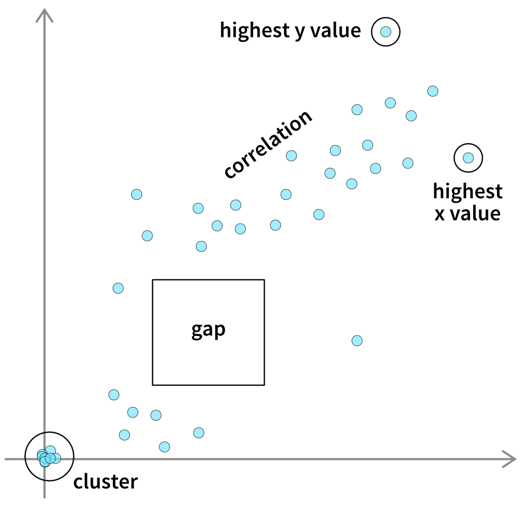 Not all interesting relations between two variables can be detected through a high correlation coefficient. Always check the scatter plot for details. [Adapted from: Data Visualization: A successful design process by Andy Kirk]
-
Are the observed correlations between variables expected?
-
-
Examine patterns in multidimensional data (using parallel coordinate plots):
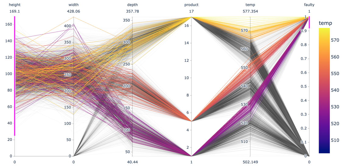 Each line in a parallel coordinate plot represents one data point, with the corresponding values for the different variables marked at the respective y-axis. The screenshot here shows an interactive plot created using the
plotlylibrary. By selecting value ranges for the different dimensions (indicated by the pink stripes), it is possible to spot interesting patterns resulting from a combination of values across multiple variables.-
Do the observed patterns in the data match our understanding of the problem and dataset?
-
-
| The data should not only be examined at the outset of an ML project, but also monitored continuously throughout the lifetime of the application, e.g., by regularly checking how many samples we received per hour, that the values for each variable are in the expected range, and that there are no unexpected missing values. |
Communicating Insights
The plots that were created during an exploratory analysis should not be the plots we show our audience when we’re trying to communicate our findings. Since our audience is far less familiar with the data than us and probably also not interested / doesn’t have the time to dive deeper into the data, we need to make the results more accessible, a process often called explanatory analysis.
| Don’t “just show all the data” and hope that your audience will make something of it — this is the downfall of many dashboards. It is essential, that you understand what goal your audience is trying to achieve and what questions they need answers to. |
Step 1: Choose the right plot type
-
get inspired by visualization libraries (e.g., here or here), but avoid the urge to create fancy graphics; sticking with common visualizations makes it easier for the audience to correctly decode the presented information
-
don’t use 3D effects!
-
avoid pie or donut charts (angles are hard to interpret)
-
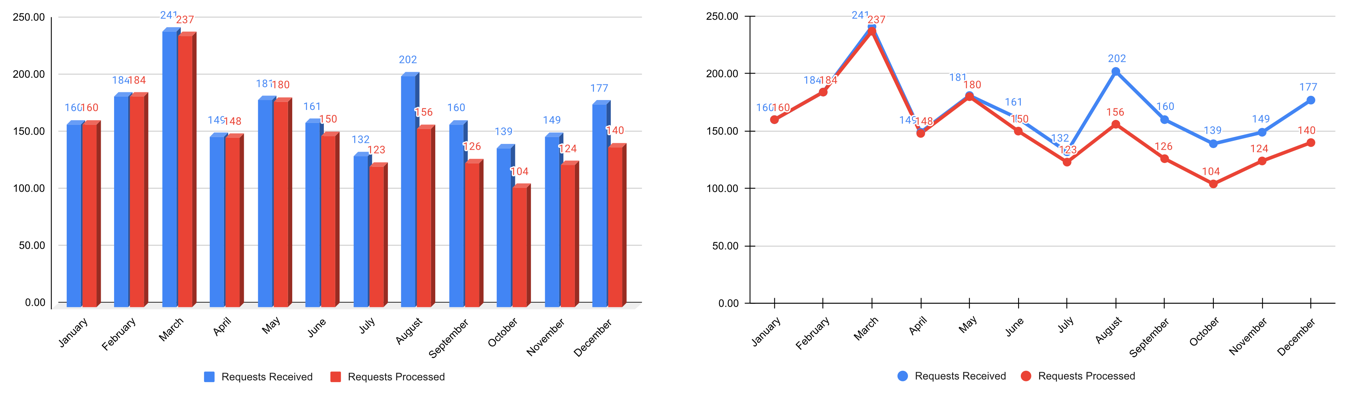
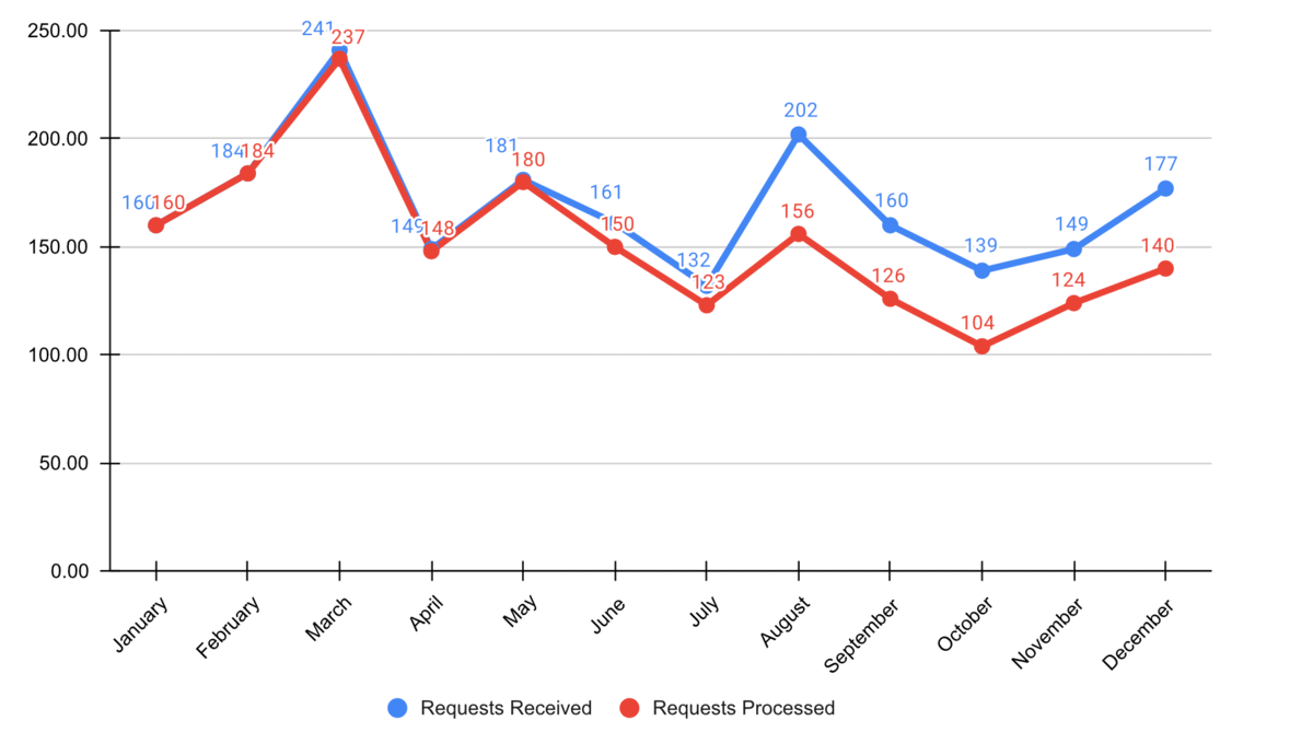
use line plots for time series data
-
use horizontal instead of vertical bar charts for audiences that read left to right
-
start the y-axis at 0 for area & bar charts
-
consider using small multiples or sparklines instead of cramming too much into a single chart
Step 2: Cut clutter / maximize data-to-ink ratio
-
remove border
-
remove gridlines
-
remove data markers
-
clean up axis labels
-
label data directly
Step 3: Focus attention
-
start with gray, i.e., push everything in the background
-
use pre-attentive attributes like color strategically to highlight what’s most important
-
use data labels sparingly
Step 4: Make data accessible
-
add context: Which values are good (goal state), which are bad (alert threshold)? Should the value be compared to another variable (e.g., actual vs. forecast)?
-
leverage consistent colors when information is spread across multiple plots (e.g., data from a certain country is always drawn in the same color)
-
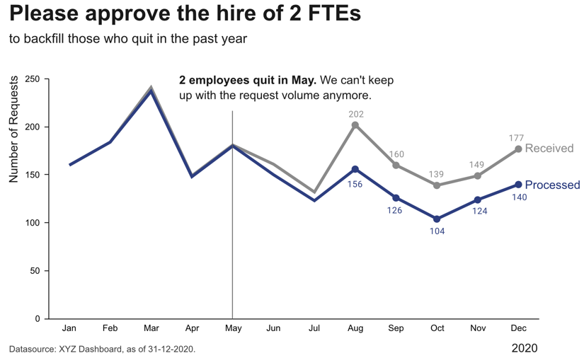
annotate the plot with text explaining the main takeaways (if this is not possible, e.g., in dashboards where the data keeps changing, the title can instead include the question that the plot should answer, e.g., “Does our revenue follow the projections?”)